
本記事のソースコードの利用によって生じた損害について、当方は一切の責任を負いません。ご自身の判断と責任のもとで参照・ご利用ください。
この記事は最終更新から2年以上経過しています。
円形プログレスバーを実装した際の備忘録。
 最近ではあまり見かけなくなったものの、一時期流行した円形プログレスバーを実装する機会があったため対応した。
プログレスバーは画面に表示されたタイミングで動作を開始するように設定した。
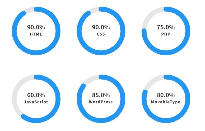
HTML、CSS(SCSS)、Javascriptを元に実装したサンプルはこちら。
意図した通りに動作したので良しとするでございます。
HTML
<div class="progress-container">
  <div
    class="progress-circle"
    data-percentage="90"
    data-color="#2196f3"
    data-thickness="15"
    data-duration="1500">
    <div class="item">HTML</div>
    <div class="percentage">0%</div>
  </div>

  <div
    class="progress-circle"
    data-percentage="80"
    data-color="#2196f3"
    data-thickness="15"
    data-duration="1600">
    <div class="item">CSS</div>
    <div class="percentage">0%</div>
  </div>
</div><!--/.progress-container-->- data-percentage・・・値を設定
- data-color・・・プログレスバーの色を設定
- data-thickness・・・プログレスバーの太さを設定
- data-duration・・・プログレスバーの速度
SCSS
.progress-container {
    display: flex;
    flex-wrap:wrap;
    gap: 60px 50px;
    /*justify-content: center;
    align-items: center;*/
    margin: 40px auto;
    width: 100%;
    max-width: 950px;
    .progress-circle {
      position: relative;
      width: 150px;
      height: 150px;
      text-align: center; /* 中央揃え */
      svg {
        transform: rotate(-90deg); /* 開始点を上に */
        position: absolute;
        top: 0;
        left: 0;
      }
      .background {
        fill: none;
        stroke: #e6e6e6;
      }
      .progress {
        fill: none;
        stroke-linecap: round;
      }
    }
    .item {
      position: absolute;
      top: 52%; /* パーセンテージの上に配置 */
      left: 50%;
      transform: translateX(-50%);
      font-size: 1.2rem;
      font-weight: bold;
      color: #333;
      letter-spacing: 1.2px;
    }

    .percentage {
      position: absolute;
      top: 42%;
      left: 50%;
      transform: translate(-50%, -50%);
      font-size: 1.8rem;
      font-weight: bold;
      color: #333;
    }
  }


  @media (max-width: 1006px) {
    .progress-container {
      max-width: 750px;
    }
  }

  @media (max-width: 806px) {
    .progress-container {
      max-width: 550px;
    }
  }

  @media (max-width: 606px) {
    .progress-container {
      max-width: 350px;
    }
  }

  @media (max-width: 406px) {
    .progress-container {
      gap: 60px 30px;
    }
  }
Javascript
<script>
  document.addEventListener("DOMContentLoaded", () => {
    const progressCircles = document.querySelectorAll(".progress-circle");

    progressCircles.forEach((circle) => {
      // データ属性の取得
      const percentage = parseFloat(circle.getAttribute("data-percentage"));
      const color = circle.getAttribute("data-color");
      const thickness = parseFloat(circle.getAttribute("data-thickness"));
      const duration = parseFloat(circle.getAttribute("data-duration"));

      // 円のサイズとプロパティの設定
      const size = 150; // 固定サイズを推奨
      const radius = (size - thickness) / 2;
      const circumference = 2 * Math.PI * radius;

      // SVG要素の作成(1つのみ)
      const svg = document.createElementNS("http://www.w3.org/2000/svg", "svg");
      svg.setAttribute("width", size);
      svg.setAttribute("height", size);
      svg.setAttribute("viewBox", `0 0 ${size} ${size}`);

      // 背景円の作成
      const bgCircle = document.createElementNS("http://www.w3.org/2000/svg", "circle");
      bgCircle.setAttribute("class", "background");
      bgCircle.setAttribute("cx", size / 2);
      bgCircle.setAttribute("cy", size / 2);
      bgCircle.setAttribute("r", radius);
      bgCircle.setAttribute("stroke-width", thickness);
      svg.appendChild(bgCircle);

      // プログレス円の作成
      const progressCircle = document.createElementNS("http://www.w3.org/2000/svg", "circle");
      progressCircle.setAttribute("class", "progress");
      progressCircle.setAttribute("cx", size / 2);
      progressCircle.setAttribute("cy", size / 2);
      progressCircle.setAttribute("r", radius);
      progressCircle.setAttribute("stroke-width", thickness);
      progressCircle.setAttribute("stroke", color);
      progressCircle.setAttribute("stroke-dasharray", `${circumference} ${circumference}`);
      progressCircle.setAttribute("stroke-dashoffset", circumference);
      svg.appendChild(progressCircle);

      // 既存の.itemと.percentage要素の前にSVGを挿入
      const itemElement = circle.querySelector(".item");
      const percentageElement = circle.querySelector(".percentage");

      // SVGを適切な位置に挿入
      if (itemElement && percentageElement) {
        circle.insertBefore(svg, percentageElement);
      }

      // アニメーション関数
      const startAnimation = () => {
        const startTime = performance.now();

        const animate = (currentTime) => {
          const elapsed = currentTime - startTime;
          const progress = Math.min(elapsed / duration, 1);
          const currentPercentage = progress * percentage;

          const offset = circumference - (currentPercentage / 100) * circumference;
          progressCircle.style.strokeDashoffset = offset;

          percentageElement.textContent = `${currentPercentage.toFixed(1)}%`;

          if (progress < 1) {
            requestAnimationFrame(animate);
          }
        };

        requestAnimationFrame(animate);
      };

      // IntersectionObserverでアニメーションのトリガーを設定
      const observer = new IntersectionObserver(
        (entries) => {
          entries.forEach((entry) => {
            if (entry.isIntersecting) {
              startAnimation();
              observer.unobserve(entry.target); // 一度だけアニメーション実行
            }
          });
        },
        { threshold: 0.1 }
      );

      observer.observe(circle);
    });
  });
  </script>